Create a proportional circles map in Google Sheets
Proportional circles maps are increasingly being used by exam boards in GCSE Geography exams. What better way to help students understand what they are and how they work than creating one for themselves in Google Sheets.
Following on from my recent post on Creating an interactive choropleth map in Google Sheets it is also very easy to create a proportional circle map in Google Sheets. I’ve put together this guide to help you through the process.
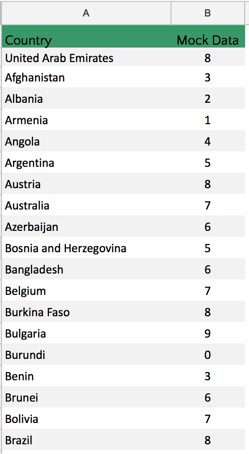
You first need to open a Google Sheet and enter a list of countries you want to include in your map. Use our Google Sheet containing a list of countries and paste it into your sheet to save time.
Next, enter the data you want to present on your choropleth map. In the example below I’ve added some mock data for demonstration purposes only.
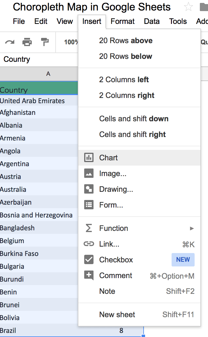
Once you have input your data highlight it then go to Insert > Chart
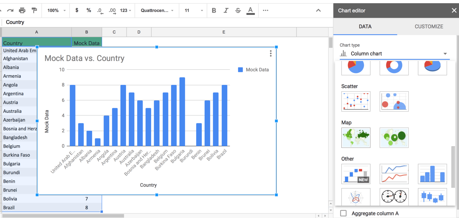
A graph will be inserted. Don’t worry, it always does this. Next, scroll down the Chart Editor and select the geo chart with markers (proportional circles map).
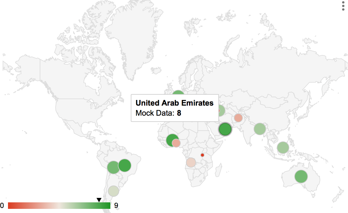
The proportional map will now be displayed. In this example, data is only presented for selective countries as I have only input a small amount of data.
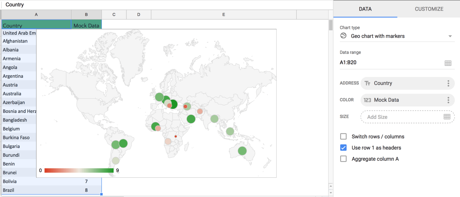
You can customise the map by pressing the Customize tab in the right-hand pane. You can change the region to continents and the colour scheme.
If you hover your cursor over a country it will display its name and value.
If you are looking to further the develop the use of Google Apps in your classroom or school our friends over at Cre8tiveIt.solutions can provide support and training with the use of Google Suite, Google Drive, Google Edu and Google Classroom.
Anthony Bennett


Leave a Reply
Want to join the discussion?Feel free to contribute!