Flourish with your data presentation and interrogation
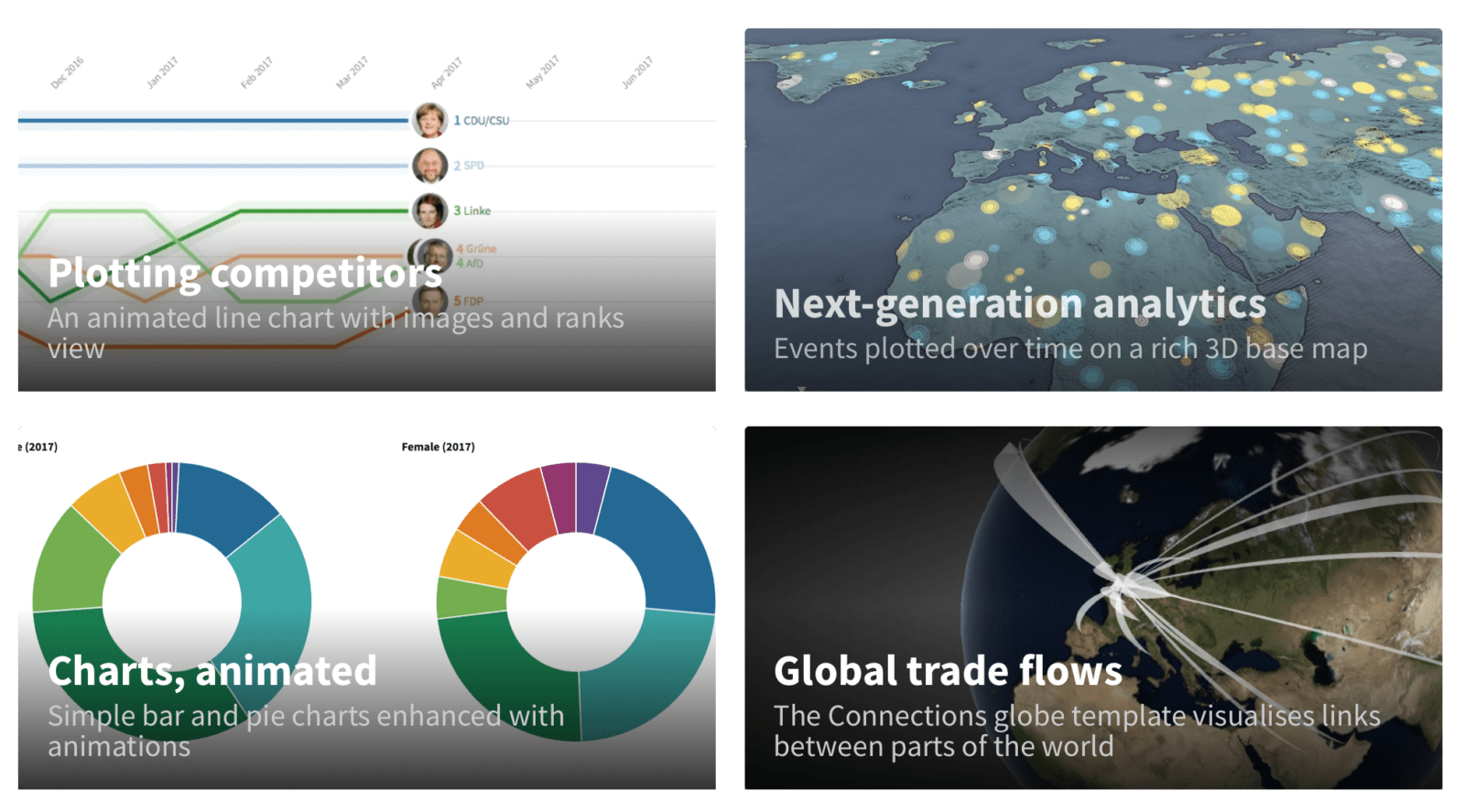
Having recently had a play with Google Sheets to present data on a choropleth map I wanted to take data presentation one step further. In my quest I found Flourish. Flourish is a web-based application that quickly turns your spreadsheets into stunning online charts, maps and interactive stories. You can create interactive, responsive data visualisations with unlimited public views with Flourish. You can then embed them on your own website or share using a digital projector.
Below is my first attempt at mapping birth rates over time.
I created this by importing a data set containing birth rates sourced from the World Bank.
The app has huge potential for presenting data in a way that will engage learners. 3D presentation brings the data to life and has the potential to turn data interrogation into something the majority could find interesting. Possible uses in Geography could include:
- plotting global migration patterns and how these have changed over time
- trade links between countries
- changes in average temperatures over time
- the impact of natural disasters and their magnitude
Anthony Bennett


Leave a Reply
Want to join the discussion?Feel free to contribute!