How do countries at different development levels have different demographic data?
As countries develop, their demographic data show distinct patterns reflecting social, economic, and healthcare differences. The three main stages of development—developing, emerging, and developed—each has unique demographic indicators, such as fertility rates, death rates, population structures, and maternal and infant mortality rates.
Developing Countries
In developing countries, demographic indicators show high birth and fertility rates but also high infant, child, and maternal mortality rates. Key features include:
- High Fertility Rates: Families tend to have many children due to limited access to contraception, low female education levels, and the need for children to help support family income and care for elderly parents.
- High Death Rates: Developing countries often have higher death rates, influenced by inadequate healthcare, poor nutrition, and limited access to clean water and sanitation. Infant mortality rates are particularly high because of limited maternal healthcare and the prevalence of diseases.
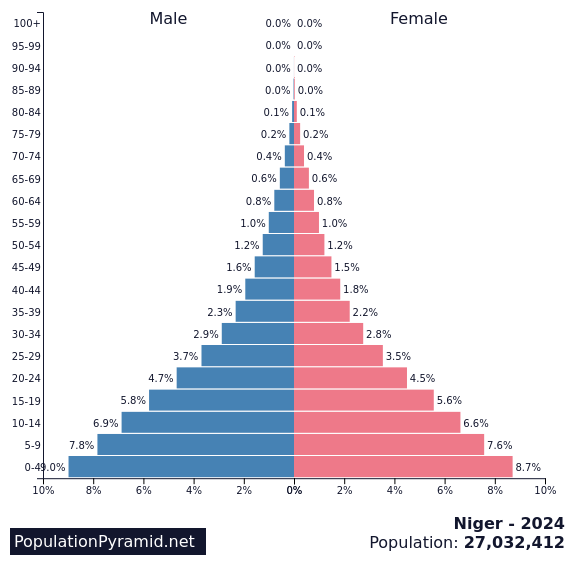
- Population Structure: Population pyramids for developing countries have a wide base, showing a large young population and high birth rates. The pyramid narrows quickly, reflecting high death rates, especially in infancy and childhood, leading to a shorter life expectancy overall.
- Maternal and Infant Mortality Rates: These are high due to poor healthcare facilities, especially for pregnant women and newborns. Many mothers lack access to skilled care during childbirth, contributing to high maternal mortality.
Emerging Countries
Emerging countries, like India or Brazil, are experiencing rapid economic growth and improvements in healthcare, education, and living standards. Their demographic data reflect this transition:
- Declining Fertility Rates: Fertility rates in emerging countries often fall as female education levels rise and women gain more employment opportunities. Family planning programs have become more widely accessible, reducing birth rates.
- Decreasing Death Rates: As healthcare systems improve, infant and maternal mortality rates fall, and people generally live longer. Access to clean water, vaccinations, and better healthcare lowers the overall death rate, especially among infants and children.
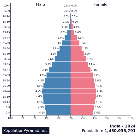
- Population Structure: In emerging countries, population pyramids show a broader middle section, indicating an increasing number of adults and a declining proportion of children. A more balanced structure suggests the beginnings of an ageing population as death rates fall and life expectancy rises.
- Maternal and Infant Mortality Rates: Although still relatively high compared to developed countries, maternal and infant mortality rates decline as healthcare and maternal services become more accessible and effective.
Developed Countries
Developed countries, such as the UK and Japan, have demographic data reflecting high living standards, advanced healthcare systems, and widespread access to education. Key indicators include:
- Low Fertility Rates: Fertility rates are typically low in developed countries due to the high costs of raising children, greater access to contraception, and higher female participation in the workforce. Cultural shifts toward smaller family sizes also contribute to lower birth rates.
- Low Death Rates with Aging Population: Life expectancy is high, and the overall death rate is low due to well-developed healthcare, high nutrition levels, and excellent sanitation. However, as populations age, death rates may rise slightly as older age groups make up a larger proportion of the population.
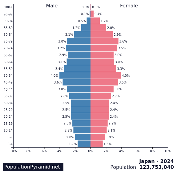
- Population Structure: Population pyramids for developed countries show a narrow base, reflecting low birth rates, and a wider top, indicating an ageing population. In countries like Japan, the broad top reflects a significant elderly population, with a high proportion over 65.
- Maternal and Infant Mortality Rates: These rates are among the lowest globally due to high-quality healthcare and comprehensive prenatal and infant care. Developed countries offer extensive maternal healthcare, which significantly lowers the risks associated with childbirth.
Summary of Demographic Patterns by Development Level
- Developing Countries: High birth rates, high death rates, high infant and maternal mortality, and a young population structure with short life expectancy.
- Emerging Countries: Decreasing birth and death rates, declining infant and maternal mortality, and a balanced population structure with a growing adult workforce.
- Developed Countries: Low birth and death rates, low infant and maternal mortality, and an ageing population structure with long life expectancy.
These demographic patterns reflect the transition through different stages of development and highlight the importance of social measures, such as healthcare and education, in shaping a country’s demographic profile. Population pyramids provide a visual representation of these shifts, showing how the structure of a country’s population evolves as it progresses through different stages of economic and social development.
Population Structure and Population Pyramids
Population pyramids are graphs that show the age and gender distribution of a country’s population. These structures reveal a lot about a country’s level of development, birth and death rates, life expectancy, and overall demographic trends. As countries progress from developing to developed, their population pyramids change shape to reflect their demographic shifts.
Population Pyramids by Level of Development
- Developing Country – Wide Base and Narrow Top
In a developing country such as Niger, the population pyramid has a wide base, indicating a high birth rate. Each bar gets narrower as age increases, which reflects high infant and child mortality rates, along with low life expectancy. This type of pyramid has a very steep taper, showing that fewer people survive into old age due to limited healthcare and high death rates across all age groups.
Niger population pyramid (2024)
- Emerging Country – Straighter Sides and Wider Middle
In an emerging country like India, the base of the population pyramid is narrower than in a developing country, showing a lower birth rate. The pyramid sides are more vertical, indicating fewer young children compared to a developing country but a large proportion of young adults. Many of these adults are of working age, reflecting a demographic shift as birth rates decline and healthcare improves, enabling more children to survive into adulthood. Life expectancy is increasing, but there are still more young people than elderly.
India population pyramid
- Developed Country – Narrow Base and Uniform Middle
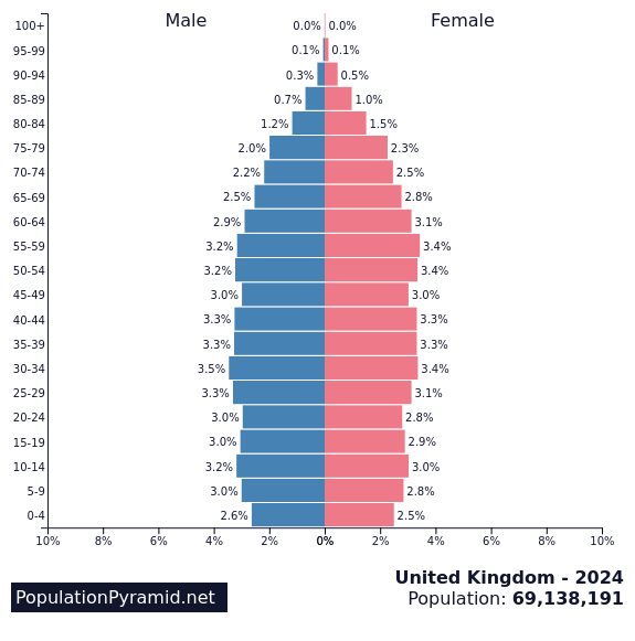
A developed country, such as the United Kingdom, has a population pyramid with a narrow base, reflecting low birth and fertility rates. The bars remain relatively even for working-age adults, showing a large proportion of people living longer and with low death rates at younger ages. This pattern suggests long life expectancy and low mortality rates among all age groups. Fewer young dependents (children) and more older adults create a more balanced population structure overall.
United Kingdom population pyramid
- Ageing Population – Narrow Base and Broad Top
In a highly developed country with an ageing population, such as Japan, the population pyramid has a very narrow base, indicating very low birth and fertility rates. The pyramid’s top is broader, showing a large elderly population (over 65 years) due to high life expectancy and low death rates among the elderly. In Japan, 26% of the population is over 65, leading to a high dependency ratio where the older population relies on a smaller workforce. Japan’s pyramid even begins to show a decline in the natural population, as death rates have exceeded birth rates in recent years.
Japan population pyramid
Summary of Population Structure Changes
As countries develop, their population pyramids transition from a wide-base, high-birth structure to a narrower, more balanced form and, eventually, to one dominated by older age groups in highly developed nations. This shift reflects improvements in healthcare, education, and economic conditions, which reduce birth and death rates and increase life expectancy. Population pyramids are a visual representation of these changes, highlighting how development impacts the age structure of a population over time.


