
Desire Lines in Geography
What is a desire line?
info
When is using a desire line appropriate?
info
Creating a desire line
Info
Step 1 – info
info
Step 2 – info
info
Step 3 – info
Reading a desire line
info
Create your own desire line
Instructions
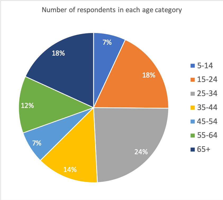
The data below shows the ages of people who were recently surveyed about hapinness in their local area. Create a pie chart to show the proportion of respondents in each age group.
5-14 = 13
15-24 = 34
25-34 = 45
35-44 = 25
45-54 = 13
55-64 = 23
65+ = 34
Answer
Download a desire line template
Of course, desire lines are much easier to create using spreadsheet software such as Excel and Google Sheets. Download an example using the data shown above.


Data Presentation Techniques in Geography
Use the images below to explore related GeoTopics.