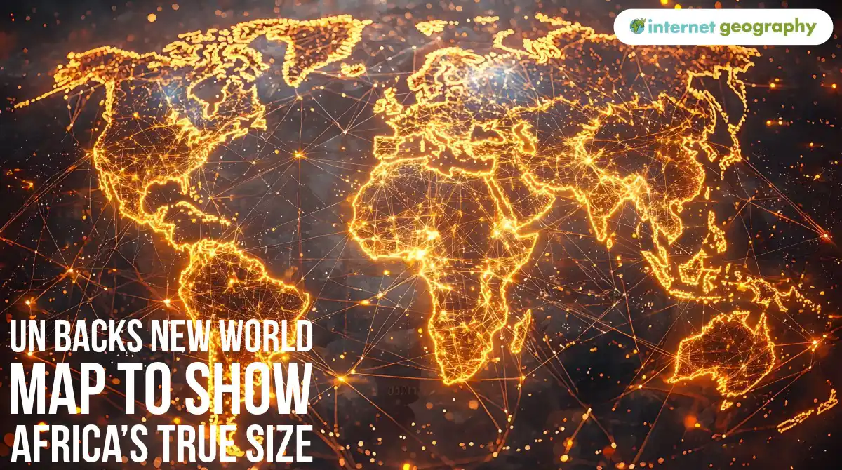
Look at a familiar world map, and you might notice something odd.
Greenland looks almost as big as Africa.
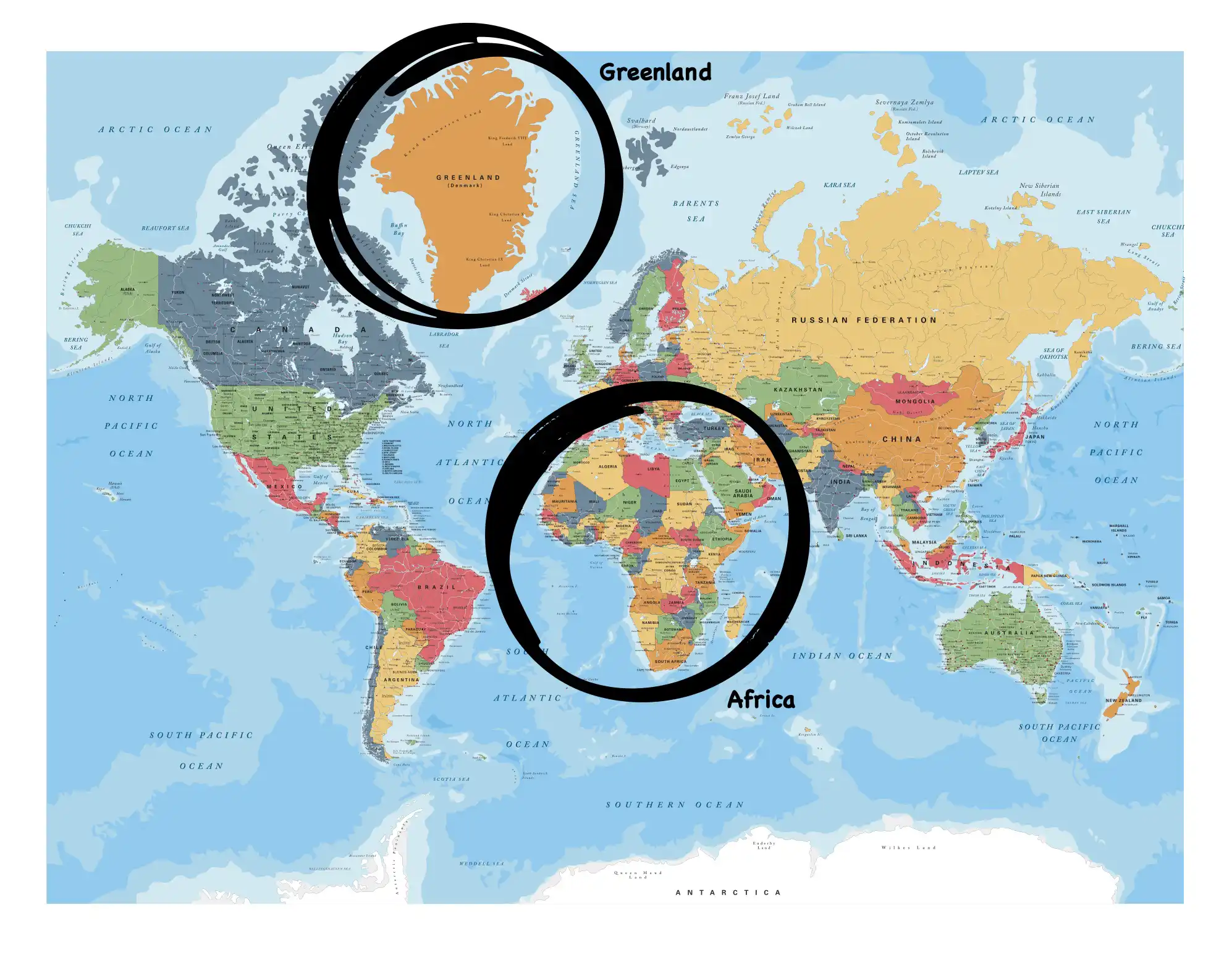
Mercator World Map – Greenland and Africa compared
But Africa is actually around 14 times larger.
This is because many world maps are drawn in a certain way. Now the United Nations has backed a campaign to encourage maps that show the relative size of continents more accurately.
On 4 September 2026, 164 countries voted in favour of a resolution supporting the use of more accurate world maps in schools, governments and international organisations. The vote was overwhelmingly in favour, but it was not unanimous.
The United States was the only country to vote against the resolution, arguing that the issue was an ideological distraction from more important international problems.
Six countries abstained: Estonia, Georgia, Lithuania, Moldova, Serbia and Ukraine.
Others have questioned how much difference changing a map will make to the challenges African countries face.
Supporters respond that correcting the map will not solve Africa’s economic or social problems, but that this is not the purpose of the campaign.
They argue that accurate geographical representation matters in its own right.
The campaign is called Correct the Map.
Why does Africa look too small?
The problem comes from trying to represent a round planet on a flat map.
Every flat world map uses a map projection, a mathematical method for transferring Earth’s curved surface onto a flat surface.
All projections create some form of distortion.
One of the most famous is the Mercator projection, created in 1569. It was designed to help sailors navigate because it preserves direction well.
However, it greatly enlarges places further from the Equator.
This means Greenland, northern Europe, Russia and Canada appear much larger than they really are compared with places closer to the Equator.
The difference between Greenland and Africa shows this clearly:
Greenland: about 2.2 million km²
Africa: about 30.3 million km²
Africa is around 14 times larger, even though many Mercator maps make the two look similar in size.
What map is being promoted?
The UN resolution promotes the Equal Earth projection, developed in 2018 by cartographers (people who create maps) Bojan Šavrič, Tom Patterson, and Bernhard Jenny.
Equal Earth is an equal-area projection, meaning countries and continents are shown in the correct size relative to one another.
On an Equal Earth map, Africa appears much larger and Greenland much smaller than on a Mercator map.
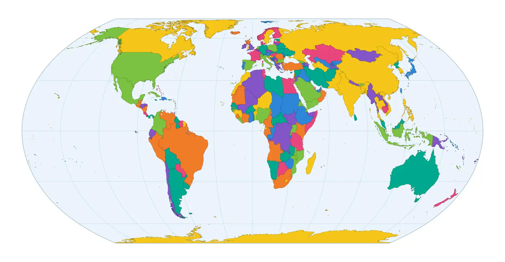
Equal Earth map projection
However, Equal Earth is not perfect.
No flat map can show the whole Earth without distortion. Equal Earth preserves area, but it changes some shapes and distances.
That is why geographers choose different map projections for different purposes.
Why does this matter?
African organisations, including Africa No Filter and Speak Up Africa, have led the campaign.
Supporters argue that maps do more than show location. They can also influence how people perceive different parts of the world.
If Africa is repeatedly shown smaller than it really is, people may underestimate its true scale and importance.
Africa is the world’s second-largest continent and covers more than 30 million km².
Campaigners believe pupils should see maps that allow them to compare the size of continents more accurately.
Has the UN banned the Mercator map?
No.
The UN resolution is not legally binding, and it has not banned the Mercator projection.
It is still useful for some purposes, particularly navigation.
Instead, the UN is encouraging schools, governments and organisations to use equal-area maps when comparing the size of countries and continents.
The important geographical lesson is not that one map is completely right and another completely wrong.
It is this:
Every map has a purpose, and every map distorts something.
Geographers therefore need to ask:
What is this map designed to show, and what might it be distorting?
The UN vote may change the world maps pupils see in classrooms in the future.
Africa has not suddenly become bigger.
We are simply being encouraged to see its true size more accurately.