
Histograms in Geography
What is a histogram?
A histogram appears similar to a bar chart. However, there are key differences between the two. Histograms are used to present continuous data (a bar chart is used to present discrete data).
When is using a histogram appropriate?
Histograms are ideal for presenting continuous data. Continuous data is data that falls in a continuous sequence e.g. time, distance and temperature. An example of this would be after counting pedestrians at 15-minute intervals over 2 hours, a histogram could be used to present the results.
Creating a histogram
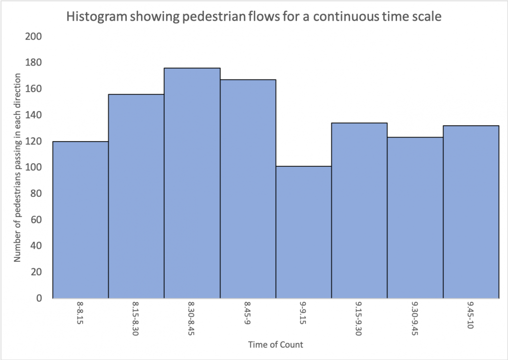
Creating a histogram is relatively simple. In this example, we are going to produce a histogram to show the results of a pedestrian count completed at 15-minute intervals over a continuous period of time. Students have collected raw data that shows the number of pedestrians that passed them during 15-minute intervals over two hours.
- 8-8.15 am – 120
- 8.15-8.30 am – 156
- 8.30-8.45 am – 176
- 8.45-9 am – 167
- 9-9.15 am – 101
- 9.15-9.30 am – 134
- 9.30-9.45 am – 123
- 9.45-10 am – 132
Step 1 – Decide on the scale of the X-axis
Decide on an appropriate scale on the X-axis for the bars. The bars should be the same width and there should be no gaps between the bars.
Step 2 – Decide on the scale of the Y-axis
Decide on a suitable scale for the Y-axis for the number of pedestrians. The scale should be spaced evenly and allow for the highest number in the data set to be included.
Step 3 – Create the histogram
Accurately draw the bars for each piece of data. As the data is continuous, each bar should be shaded in the same colour
Step 4 – Finish your graph
Include a title and label each axis.
Reading a histogram
To read a bar chart, read along the x-axis (bottom) to find the bar you want to read. Go to the top of the bar and read across to the scale on the y-axis to work out the value. Using a ruler can help with this.
Create your own histogram
Instructions
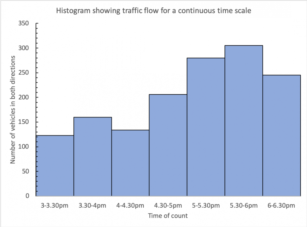
The data below shows equal class intervals of vehicle flow for a continuous timescale. Present the data as a histogram.
3-3.30pm = 123
3.30-4pm = 160
4-4.30pm = 134
4.30-5pm = 206
5-5.30pm = 280
5.30-6pm = 305
6-6.30pm = 245
Answer
Download a histogram template
Of course, histograms are much easier to create using spreadsheet software such as Excel and Google Sheets. Download an example using the data shown above.


Data Presentation Techniques in Geography
Use the images below to explore related GeoTopics.