What does world development look like?
The pattern of world development has changed over time.
The map below shows the global distribution of countries according to their level of economic development.
The 2024 map above shows that most High-Income Countries (HICs) are situated in the northern hemisphere, with notable exceptions being Australia and New Zealand. HICs are densely populated in regions such as Western Europe, North America, the Middle East (including nations like Saudi Arabia, Qatar, and the UAE), and East Asia (encompassing Japan, South Korea, and Singapore).
The geographic distribution of Newly Emerging Economies (NEEs) and Low-Income Countries (LICs) is more complex and subject to continuous change. Noteworthy trends include South American nations being categorised as NEEs, Asia's shift towards having more NEEs than LICs, and Africa's continued dominance of LICs over NEEs. Eastern European nations, including some European Union members, are predominantly classified as NEEs.
The pattern of economic development across the globe has significantly changed over time. There was a clear divide between the rich north and poor south. The Brandt Line was used to mark this divide.
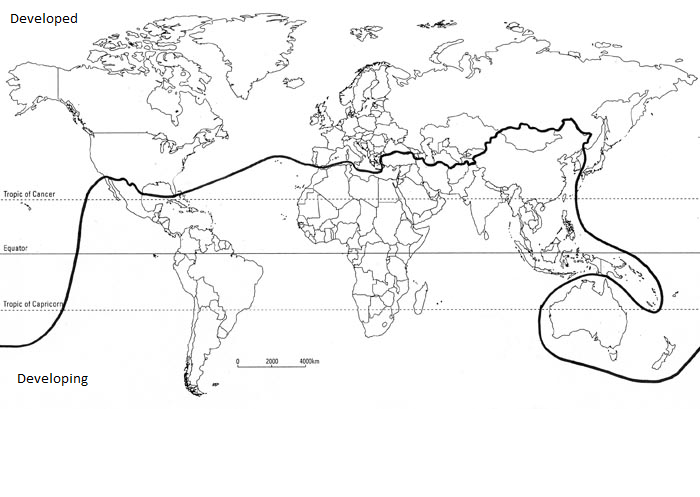
A world map showing the Brandt Line
The global economic development landscape has undergone significant transformations over time. The 1980s' distinct separation between the affluent 'global north' and the impoverished 'global south,' once visually represented by the Brandt Line, is becoming largely a notion of the past. Several key developments underscore this shift: China's emergence as the world's largest economy, high-income countries like Qatar, Kuwait, and Singapore residing south of the Brandt Line, and countries such as Hungary and Bulgaria within the EU having a lower GNI per capita than Brazil and Malaysia. Moreover, a considerable presence of millionaires and billionaires is now a feature across every inhabited continent, including Africa.


Use the images below to explore related GeoTopics.