
Line Graphs in Geography
What is a line graph?
A line graph is a simple graphical technique to show changes over time (continuous data). In all line graphs, you will find an independent and dependent variable.
An independent variable is a variable that stands alone and isn’t changed by the other variables you are trying to measure.
A dependent variable is a variable that is changed by other variables.
An easy way to remember this is to insert the names of the two variables you are using in the sentence below in the way that makes the most sense. Then you can figure out which is the independent variable and which is the dependent variable:
(independent variable) causes a change in (dependent variable), and it isn’t possible that (dependent variable) could cause a change in (independent variable).
If we take a traffic count that is completed over a period of time, the sentence would only work like this:
Time causes a change in the number of vehicles, and it isn’t possible that the number of vehicles could cause a change in time. Therefore, time is our independent variable, and the number of vehicles is the dependent variable.
Line graphs can show multiple sets of data over time.
When is using a line graph appropriate?
A line graph is appropriate for presenting continuous data.
Creating a line graph
Creating a line graph is relatively simple. In this example, we will produce a line graph to show the results of a traffic count. Students have collected raw data that shows the number of vehicles travelling along High Street at hourly intervals. The data is shown below.
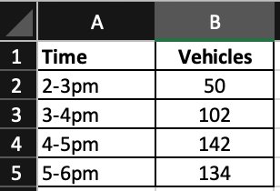
Line graph data
Step 1 – Plot your axis
Plot your axis. The independent variable should be plotted along the horizontal x-axis. The dependent variable should be plotted on the horizontal y-axis.
Step 2 – Plot your data
Using your raw data, make a mark (e.g. x) at the point where the two values meet on the graph.
Step 3 – Join up the marks
Using a ruler, join the marks you have made with a line.
Your graph will look something like this:
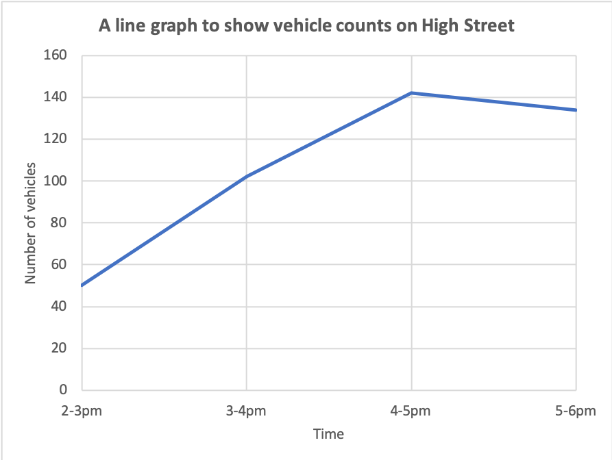
Traffic count line graph
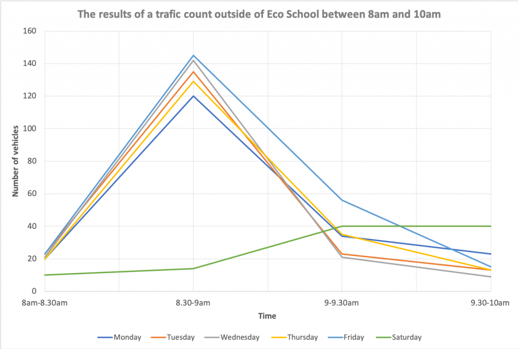
Line graphs can show multiple sets of data, as shown below.
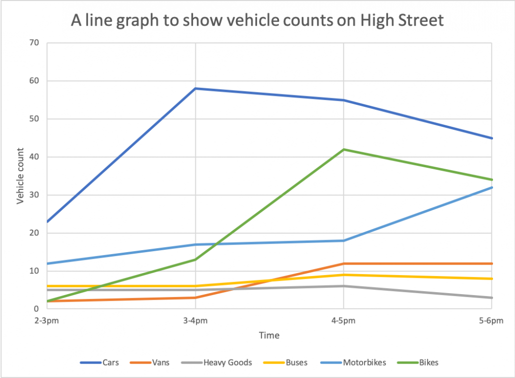
A line graph showing multiple sets of data
Reading a line graph
To read a line graph, you need to read along the correct scale to find the value you want. Then read along across or up to the line you want, then read the value of the other scale.
Create your own line graph
Instructions
The data below shows the results of a series of traffic counts outside of Eco School. Produce a line graph using the data.
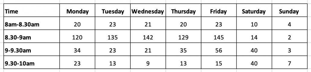
Traffic count data
Answer
Download a line graph template
Of course, line graphs are much easier to create using spreadsheet software such as Excel and Google Sheets. Download an example using the data shown above.


Data Presentation Techniques in Geography
Use the images below to explore related GeoTopics.