
Pie Charts in Geography
What is a pie chart?
A pie chart or divided circle is a basic graphical technique for presenting a quantity that can be divided into parts. Pie charts show amounts or percentages. Pie charts can also be drawn as proportional circles.
When is using a pie chart appropriate?
Pie charts are best to use when you are trying to compare parts of a whole. They do not show changes over time.
Creating a pie chart
Creating a pie chart is relatively simple. In this example, we are going to produce a pie chart to show the different land use in a town centre in the UK. Students have collected raw data that shows the total number of different land uses in the town centre. This is shown below:
- residential (houses) – 2
- commercial (shops) – 24
- business and financial services (e.g. banks) – 3
- leisure and recreation (including restaurants) – 6
- industry – 2
- transport – 1
Step 1 – Calculate percentages
The first step is to calculate the percentage of each land use based on the total number. There are a total of 38 different buildings. We need to calculate the proportion of these that are residential, commercial etc. To do this we need to divide each land use by the total. So, in the case of commercial 24 is divided by 38 then multiplied by 100 to calculate the percentage. The percentage of buildings used for commercial reasons is 63.2%.
This process needs to be repeated for all the other land uses. The calculations are:
- residential (houses) – 5.3%
- commercial (shops) – 63.2%
- business and financial services (e.g. banks) – 7.9%
- leisure and recreation (including restaurants) – 15.8%
- industry – 5.3%
- transport – 2.6%
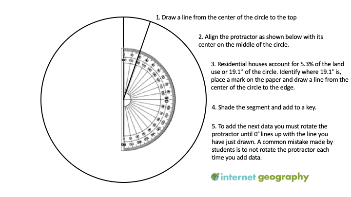
Step 2 – Calculate degrees
The next step is to draw a circle. This can be done using a compass. As a circle is 360°, 1% is equal to 3.6°. Next, you need to calculate the number of degrees each percentage will be by multiplying each by 3.6. The calculations have been completed below:
- residential (houses) – 19.1°
- commercial (shops) – 227.5°
- business and financial services (e.g. banks) – 28.4°
- leisure and recreation (including restaurants) – 56.9°
- industry – 19.1°
- transport – 9.4°
Step 3 – Create the pie chart
The final step is to create your pie chart. This is shown below.
Reading a pie chart
If you need to extract data from an existing pie chart, it is easy with a bit of reverse engineering. To work out what % a segment is of the whole, simply use a protractor to identify the number of degrees the segment takes up. Then divide it by 3.6. You will then have a percentage.
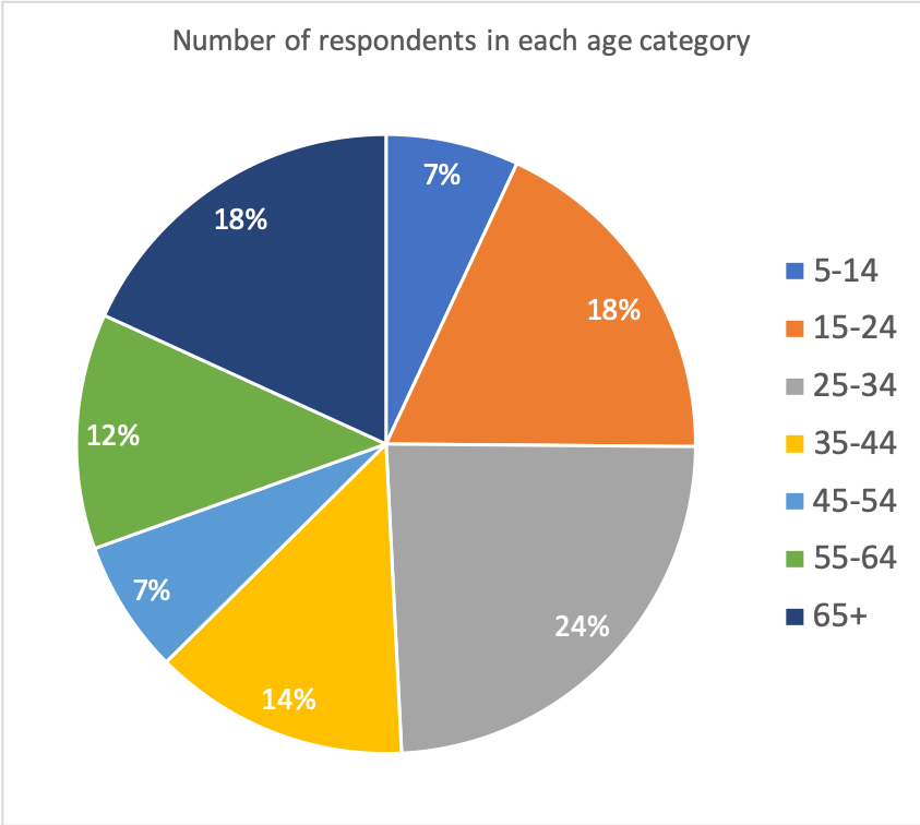
Create your own pie chart
Instructions
The data below shows the ages of people recently surveyed about happiness in their local area. Create a pie chart to show the proportion of respondents in each age group.
5-14 = 13
15-24 = 34
25-34 = 45
35-44 = 25
45-54 = 13
55-64 = 23
65+ = 34
Answer
Download a pie chart template
Of course, pie charts are much easier to create using spreadsheet software such as Excel and Google Sheets. Download an example using the data shown above.


Data Presentation Techniques in Geography
Use the images below to explore related GeoTopics.