
Scatter Graphs in Geography
What is a scatter graph?
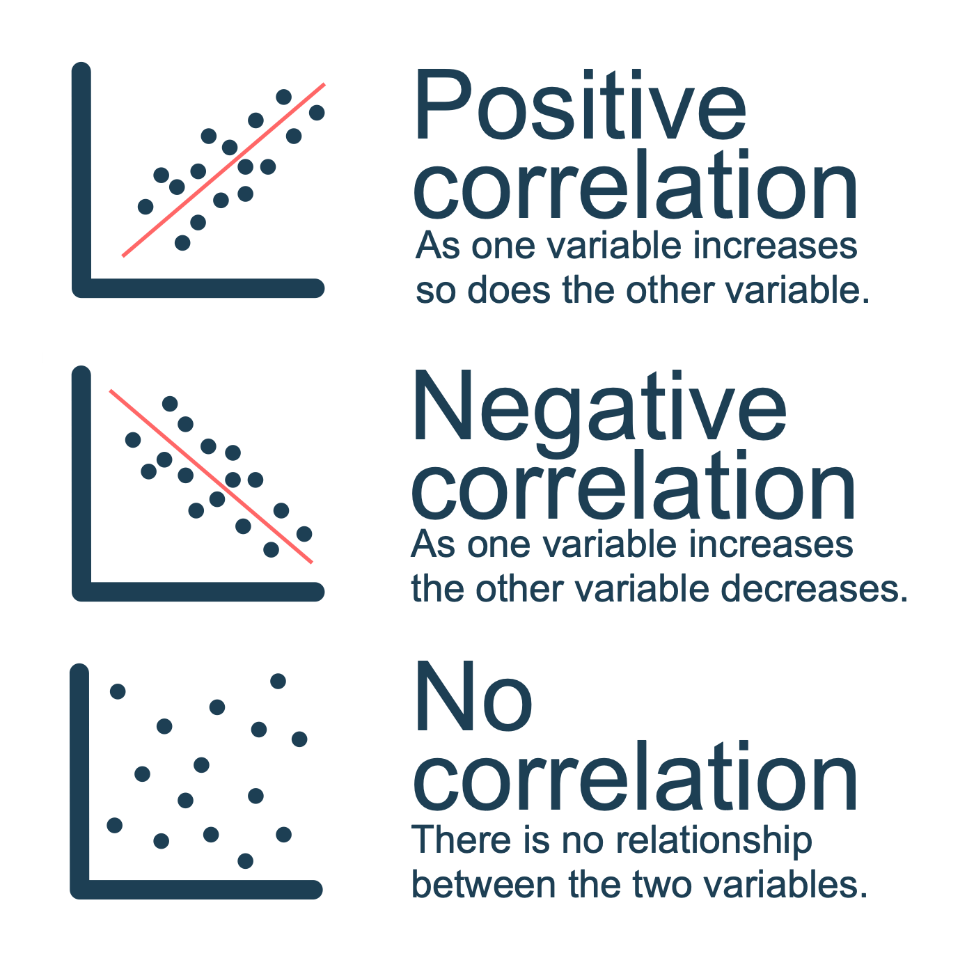
A scatter graph is used to investigate a relationship (link) between two pieces of data. Once the data has been plotted the pattern of points describes the relationship between the two sets of data. A line of best-fit should be drawn on the graph after the points have been plotted. The line will indicate the correlation (strength of relationship) between the two data sets (variables). Relationships can be positive, negative or will have no correlation at all.
When is using a scatter appropriate?
A scatter graph is appropriate when you are investigating whether there is a relationship between two variables.
Creating a scatter graph
In this example, we will investigate whether there is a relationship between the width and depth of a river as it moves from source (1) to mouth (10). We will use the data below in this example.
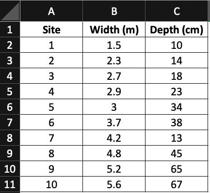
River depth and width data
Step 1 – Identify the data types
identify the independent variable and the dependent variable. In this case, there are no independent and dependent variables. If we were plotting distance from the source by depth, the distance would be the independent variable (and plotted on the x-axis) and the depth would be dependent (plotted on the y-axis).
Step 2 – Draw your axis
come up with an appropriate scale on the x-axis for the width. Make sure the scale allows the highest value to be plotted. Repeat this for the depth of the river on the y-axis. Remember to label your axis.
Step 3 – Plot the measurements
Plot them measurements on the graph, labelling each site.
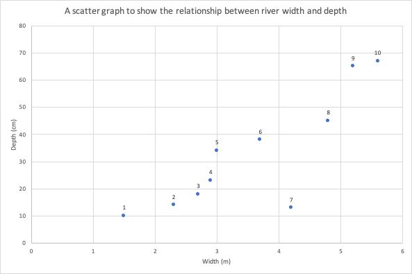
A scatter graph to show the relationship between river depth and width
Step 4 – Line of best fit
Draw a line of best fit. This is a straight line through the middle of the data points. From the line of best fit, you can identify the type of correlation between the two sets of data. In this case, there is a positive correlation between river depth and width.
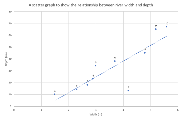
Line of best fit
Reading a scatter graph
The line will indicate the correlation (strength of relationship) between the two data sets (variables). Relationships can be positive, negative or will have no correlation at all.
Create your own scatter graph
Instructions
The data below shows the depth of a stream with distance from the source. Create a scatter graph with a line of best fit.
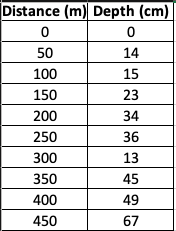
Distance vs depth data
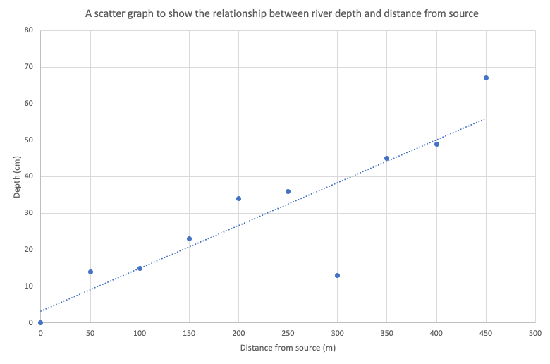
Answer
Download a scatter graph template
Of course, scatter graphs are much easier to create using spreadsheet software such as Excel and Google Sheets. Download an example using the data shown above.


Data Presentation Techniques in Geography
Use the images below to explore related GeoTopics.