
Choropleth Maps in Geography
What is a choropleth map?
A choropleth map is a map that is shaded according to a range of values presented in a key. Choropleth maps are popular thematic maps used to represent statistical data through various shading patterns or symbols on predetermined geographic areas (i.e. countries).
When is using a choropleth map appropriate?
A choropleth map is appropriate when presenting data for geographical areas and regions. Common uses of choropleth maps include presenting population density (e.g. the number of people per km2), weather and climate data and development indicators such as GDP and life expectancy. Choropleth maps are also appropriate for indicating differences in land use, like the amount of recreational land or type of forest cover.
The map below shows population density by country. It is common for shades of one colour to be used, with the darkest representing the highest value. The key represents population density, expressed as the number of people divided by land area measured in square kilometres.
What are the disadvantages of using choropleth maps?
Despite choropleth maps providing a good visual picture of changes between areas, there are disadvantages of using them including:
- distorting data by displaying abrupt changes at boundaries between areas
- they can be difficult to read as it can be hard to distinguish between different shades
- variations within areas and regions are disguised, for example, population density within an area might vary significantly, however, only the mean is shown.
Creating a choropleth map
Creating a choropleth map is easy. Follow the step by step guide below.
Step 1 – Gather your data
Gather the data you need present. Next, find the range of your values and develop a shading scale. Between 4 and 8 shading bands should be appropriate. Ensure the shading bands get darker as values increase.
Step 2 – info
Source a base map of the area(s) or region(s) you are presenting data for. Include the key and title on your map.
Step 3 – info
Shade the areas/regions according to where they fit on the scale.
You can also create choropleth maps in a range of software including Google Sheets (see the Internet Geography tutorial), Microsoft Excel and Arc GIS.
Describing a choropleth map
TEA is a great acronym to use when describing patterns on a choropleth map. TEA stands for trend, example and anomaly.
Trend
What is the general pattern shown on the map?
- Is there an even distribution (spread)?
- Is there an uneven distribution (spread)?
Examples
Discuss the pattern on the map including examples. You could consider:
- What continents/countries are most of the feature contained in?
- Which have the least?
- Are these HICs or LICs?
- Are they near the equator or further away?
- Are they inland or coastal?
Anomalies
Are there any areas/regions that stand out as being extremes (either at the top or the bottom of the scale).
The map below shows a choropleth map showing rainfall data for the UK. Before we can describe it we need to establish exactly what the map shows. From the information provided, we can see that the map shows rainfall data for April 2020. It is clear that the map does not show rainfall totals. Instead, it shows the amount of rainfall that has occurred as a percentage of the 1961-1990 average. If the map was shaded white (75-125%), it would mean that the amount of rain that fell in April would be close to the average rainfall that occurred between 1961 and 1990. However, it is clear from the map that this is not the case. A large proportion of the map is shaded brown. This means that much of the country experienced less rainfall in April 2020, compared to the average for 1961-1990. Now we have established what the map shows, we can now describe it. An example is included below the map.
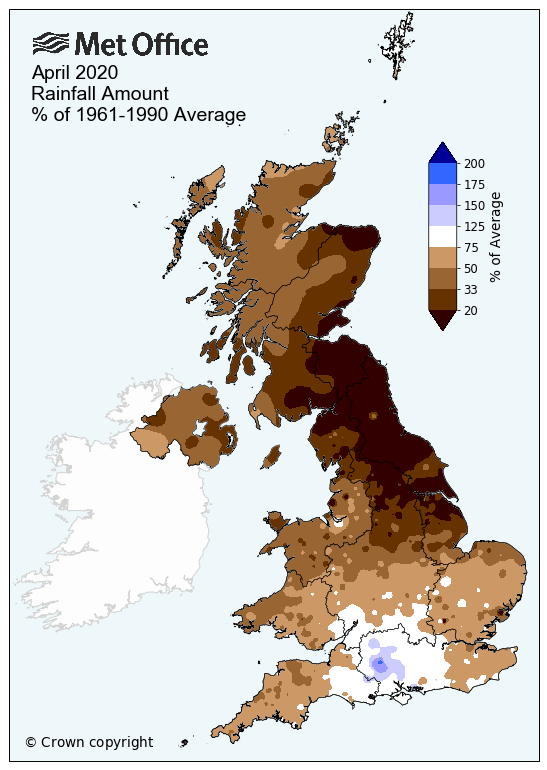
Rainfall amount April 2020 as % of average
The choropleth map shows that rainfall during April 2020, compared to the average for 1961-1990 was uneven across the UK. Large parts of the UK, particularly the north of England and Scotland, the Midlands, the east of England and Wales experienced below-average rainfall (<75%). However, in central-southern areas of England rainfall levels were closer to the average for 1961-1990. There are some clear anomalies in rainfall patterns. In the northeast of England and Scotland rainfall levels were significantly below average. In addition to this, some areas in southern England experienced rainfall significantly above average.
Create your own choropleth map
Have a go at this tutorial to create a choropleth map using Google Sheets.


Data Presentation Techniques in Geography
Use the images below to explore related GeoTopics.