
Dispersion Graphs in Geography
What is a dispersion graph?
A dispersion graph shows the range of a set of data and illustrates whether data groups or is dispersed. It is a useful way of comparing sets of data. Values are plotted on the vertical axis.
When is using a dispersion graph appropriate?
Dispersion graphs are ideal when you want to compare sets of data and can be used to present where the UQ and LQ are, as well as the mean, median, mode and extreme values and interquartile range.
Creating a dispersion graph
In this example, we will create a dispersion graph to show the size of pebbles at three sites along a river. The data below will be plotted on a dispersion graph. The pebbles have been measured in mm.
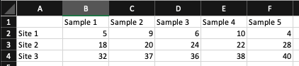
Dispersion graph data
Step 1 – Vertical axis
Review the data and decide upon a scale. In this case, the highest value is 40 mm so the vertical scale will run from 0 to 45 at 5 mm intervals. Plot the scale for the vertical axis.
Step 2 – Horizontal axis
The horizontal axis has three entries, one for each site. Add this to your graph. Remember to label your axis.
Step 3 – Plot
Plot the data on your graph. Below is an example of how your dispersion graph might look.
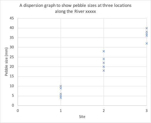
Dispersion graph for pebbles sampled at three sites
Reading a dispersion graph
Read the title to see what the graph is showing. Ensure you understand what each axis represents. Identify outliers (anomalies in the data). Investigate the patterns show on the graph. Complete statistical analysis e.g. what is the mean (you could then plot this in a different colour), what is the range?, What is the media? What is the interquartile range? etc.
Create your own dispersion graph
Instructions
The data below shows pebble sizes (cm) recorded at 3 locations along the beach at Flamborough. Using the data, create a dispersion graph.
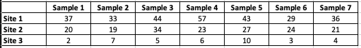
Data for pebble measurements at Flamborough
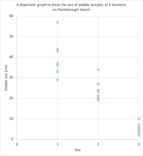
Answer
Download a dispersion graph template
Of course, dispersion graphs are much easier to create using spreadsheet software such as Excel and Google Sheets. Download an example using the data shown above.


Data Presentation Techniques in Geography
Use the images below to explore related GeoTopics.