
Pyramid Pyramids in Geography
What is a population pyramid?
A population pyramid is typically used to present age-sex data for an area. They look like two bar charts on their sides. They are usually presented as five or ten-year age groups with males on one side and females on the other. Horizontal bars are drawn to present the number or proportion of males and females in each age group.
When is using a pyramid chart appropriate?
A pyramid chart is appropriate for presenting population data to show a country’s population’s age and gender breakdown. Pyramid charts can be used when two sets of continuous data are available, for example, a pedestrian count for a continuous timescale showing people moving in two directions.
Creating a Population Pyramid
There are two ways of presenting population pyramids. The first is with the y-axis plotted to the left (see below), and the data is expressed as percentages.

Population Pyramid for the UK
The second is with the y-axis being plotted between the bars (as shown below); in this case, the raw population data is shown.
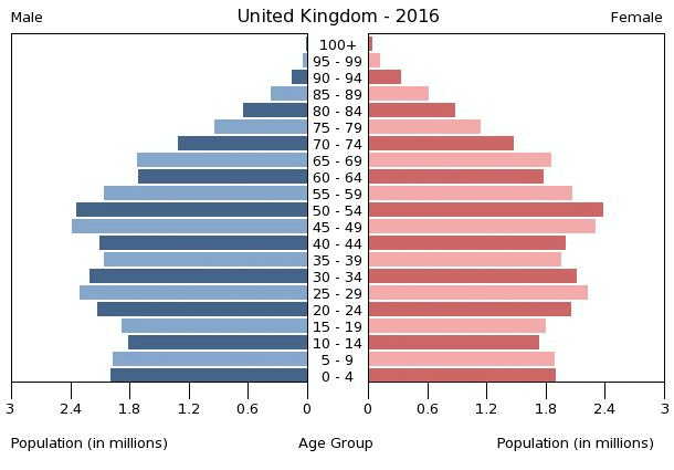
A population pyramid for the UK in 2016
Step 1
Draw the horizontal and vertical axis for your pyramid pyramid. The same scale should be on either side of the horizontal (x) axis.
Step 2
Draw each of the bars to the correct value.
Step 3
The bars should be coloured the same because it is continuous data.
Why are population pyramids important?
A population pyramid provides the age-sex structure of the population. A range of information can be extracted from a population, including:
- birth rate, death rate, life expectancy, male-female migration, working and dependent population
- an indication of the stage a country is at on the demographic transition model
- predicting future population projection
- helping in demographic and economic planning- what kinds of services and facilities will be needed in future.
Interpreting a population pyramid
Population pyramids can appear quite complicated when you study one for the first time. The shape of a pyramid chart provides an overview of the data. Use the pointers below to help interpret population pyramids:
- A wide base indicates a high birth rate as many babies are being born.
- A narrow base shows a low birth rate as small numbers of children are born.
- A broad top or wide apex indicates a high proportion of people living longer.
- Straight or near vertical sides depict a low death rate. A population pyramid with fairly straight sides (more like a barrel) shows a population with a falling birth rate and a rising life expectancy.
- Rapidly tapering top or concave slope suggests a high death rate and low life expectancy. Over time, as a country develops, the shape changes from triangular to barrel-like. Places with an ageing population and a very low birth rate would have a structure that looks like an upside-down pyramid. A very triangular population pyramid (e.g. Mozambique in 2000) shows a population with a high number of young dependents and a low life expectancy.
- Bulges in the slope indicate a high rate of immigration or a preceding baby boom year. This could be because of the economic migrants if the bulges are typically in the working age population group. On the other hand, if the bulges appear at the retirement age group, then that can be attributed to the counter migration or returning migrant flow or the due to the maturity of the baby boom cohorts.
- Sudden indents at the side of the pyramid indicate higher death rates than normal may be because of a war, famine, disease (epidemic) or natural catastrophe.
- Deficits in slopes or distorted patterns in the same cohorts signify gender-specific out-migration (e.g. in young, working males) or sex-specific death rate.
Click here for the visual display of the changing population structure of the World from 1950 to 2050
Create your own population pyramid
Instructions
Create a pyramid graph for the population structure of the USA in 2014 using the data below.
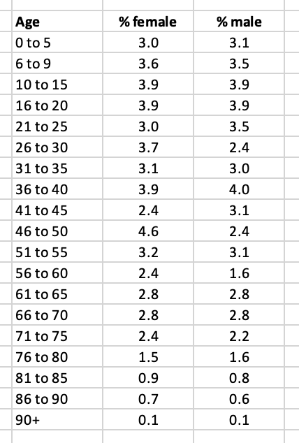
US Population Data for 2014
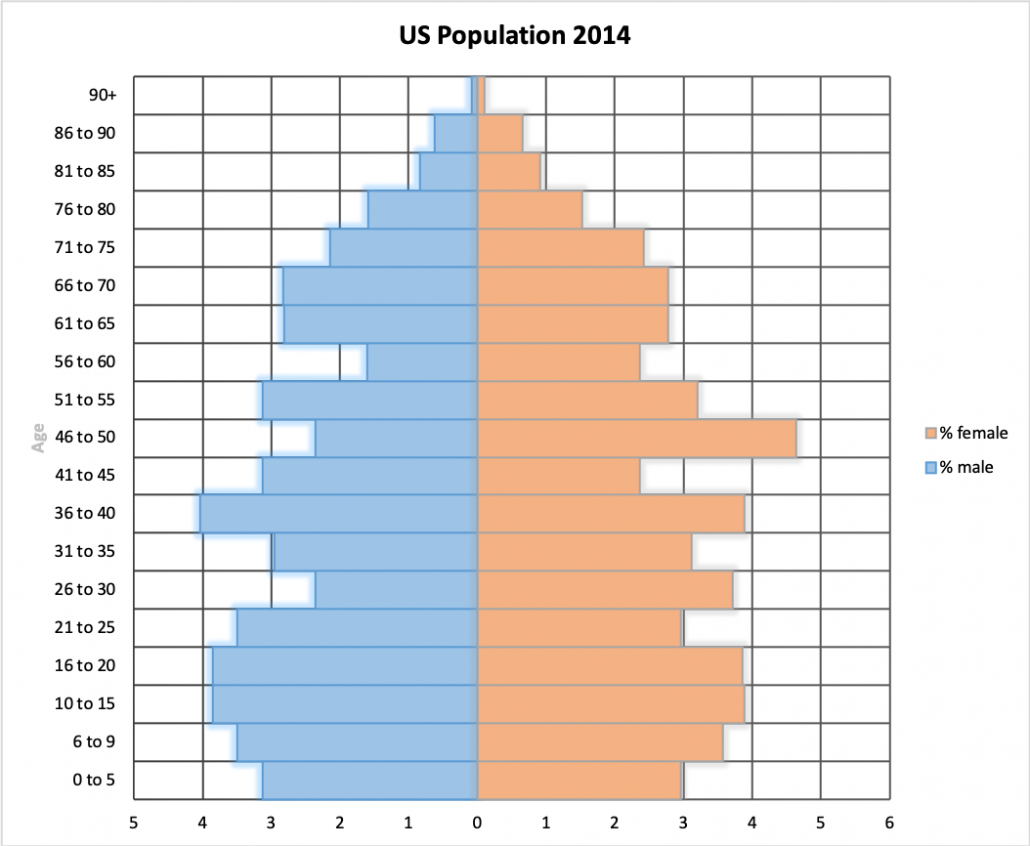
Answer
Download a population pyramid template
Of course, population pyramids are much easier to create using spreadsheet software such as Excel and Google Sheets. Download an example using the data shown above.


Data Presentation Techniques in Geography
Use the images below to explore related GeoTopics.