Skills Plus Baseline 1 Data Presentation
If you are here, it’s probably because you need to work on some of the data presentation skills covered in Skills Plus Baseline 1.
Study the information below (you might find it helpful to make notes or revision cards) and attempt the interactive activities to help improve your geographical skills.
Types of Graphs and Charts
There are many different types of graphs and charts used in geography. In Skills Plus Baseline 1, you were asked to identify five different types. These were a bar chart, line graph, histogram, pie chart, and compound line graph.
Bar Chart
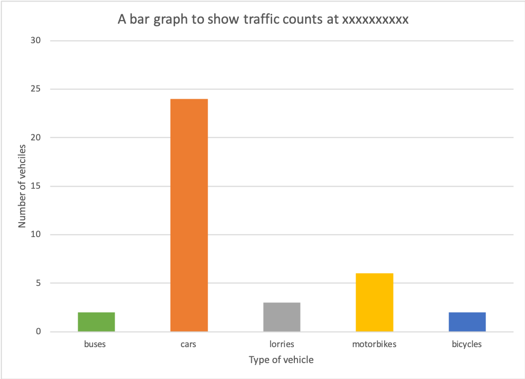
A bar chart is one of the most simple forms of presenting data. Each bar is the same width and should be drawn an equal distance apart.
Bar charts are used for presenting discrete data. This is when each value is separate and different. In the example in Skills Plus Baseline each bar represented a different mode of transport.
Line Graph
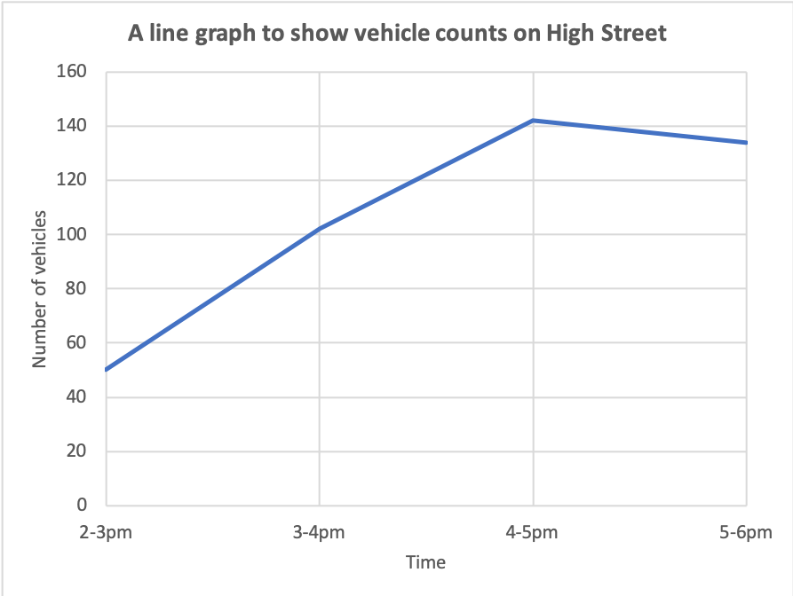
Traffic count line graph
A line graph is a simple graphical technique to show changes over time (continuous data). In all line graphs, you will find an independent and dependent variable. The independent variable in the graph above is time. The number of vehicles doesn’t change time. The number of vehicles is dependent because their number is affected by time, e.g. there are more vehicles at 4-5 pm because it is rush hour.
Histograms
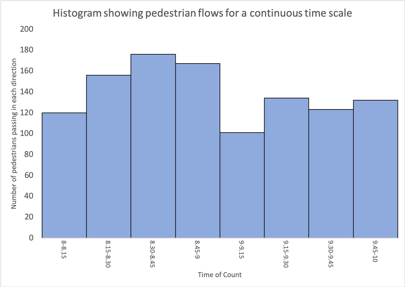
Histograms appear similar to bar charts (it’s possible that you identified this as a bar chart on Skills Plus Baseline 1 – don’t worry, it’s a common mistake). However, histograms are used to show continuous data. Continuous data is in a sequence (along the x-axis, e.g. over time, distance, temperature). In the example above, the data is continuous as it is over time. Another way to recognise a histogram is that there are no gaps between the bars.
Pie Chart
A pie chart or divided circle is a basic graphical technique for presenting a quantity that can be divided into parts. Pie charts show amounts or percentages.
Compound Line Graph
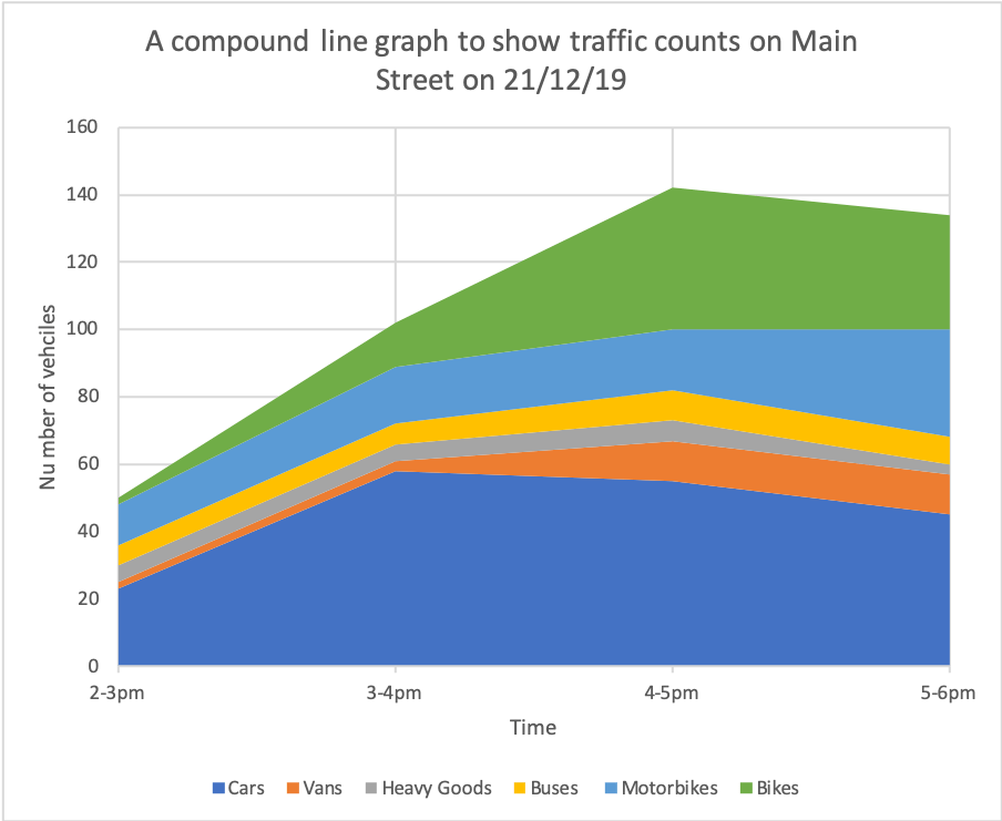
A compound line graph is a development of a line graph. They show layers of continuous data.
They show layers of continuous data and allow you to see the proportion that makes the total.
The differences between the points on adjacent lines give the actual values on a compound line graph. To show this, the areas between the lines are usually shaded or coloured, with an accompanying key.
Activity
Drag and drop the labels below to identify the different types of graphs.
Line Graphs
Line graphs are fairly straightforward to create. The example below shows the completed line graph from Skills Plus Baseline 1.
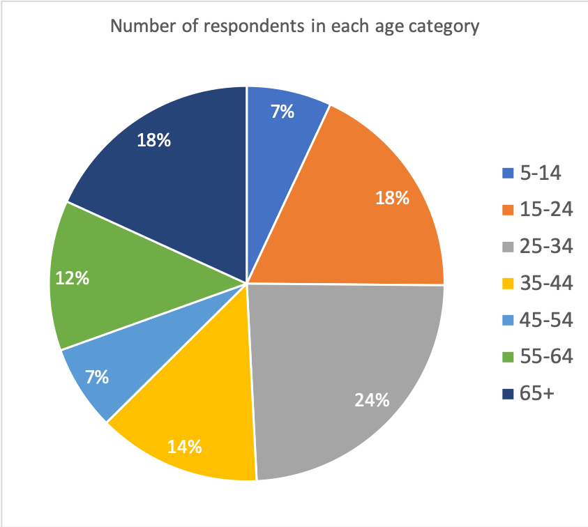
Pie Charts
You were asked to produce a pie chart to show the number of respondents in each age group for a happiness survey.
The steps you should have taken to do this are:
- Convert the results into percentages.
- Plot the percentages onto the pie chart.
Converting results into percentages
To do this, you need to add up all the values, e.g. 13+34+45+25+13+23+34 = 187
To calculate each percentage, you need to divide each value by the total, then multiply by 100, e.g. 5-14-year-olds – 13 / 187 x 100 = 6.95 (we’ll round it up to 7%).
Once you have all the percentages, you need to plot these onto the pie chart. However, this is not straightforward. There is another calculation you can do to accurately plot the percentages onto the pie chart.
A circle is 360°. Which means 360° is 100%. If we divide 360° by 100, we get 3.6°. This means 1% on the pie chart is 3.6°. If you now times each of the percentages by 3.6 you will get the number of degrees of the circle each percentage makes up. You can now use a protractor to complete the pie chart. We’ve got a worked example if you are still unsure how to do this.
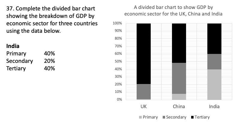
Divided Bar Chart
You were given the percentages for the divided bar chart you were asked to complete. It is important to remember that when you complete the graph, the data should be plotted in the same order as the already complete bars, e.g. primary first, secondary, then tertiary. The bar should also be the same width as the other bars. Finally, shade the bars to match the key. You can see how the data should be plotted below.
A completed bar chart for the Skills Plus Baseline 1