How can coastal fieldwork data be presented on Google My Maps?
Presenting data collected during a coastal fieldwork study is really simple on Google My Maps. There is a range of ways data can be presented. As part of an investigation into the impact of groynes on longshore drift, we are going to present data showing the difference in height between the updrift and downdrift beach for each groyne.
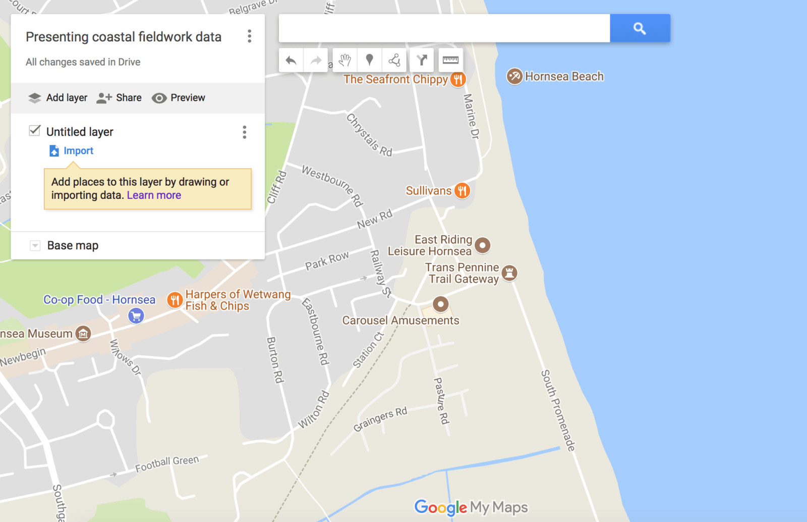
To get started open Google My Maps. Zoom into your field study location. This tutorial uses Hornsea on the Holderness Coast as an example. The image below shows the field study location.
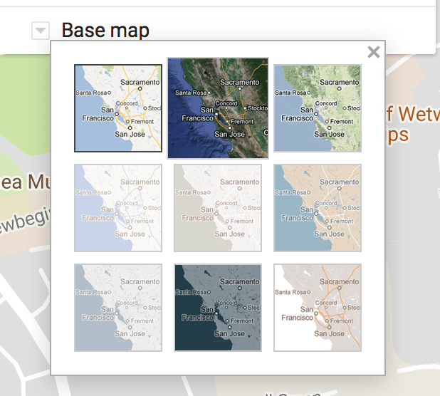
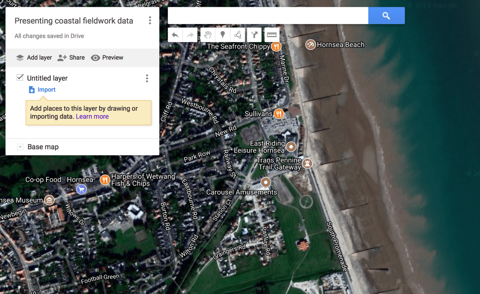
Groynes are not shown in Google Maps so we need to switch the base map to satellite.
We can now see the groynes clearly on the base map.
Next, we will identify the sample sites by dropping a pin at each location data was collected. To do this click the marker icon:

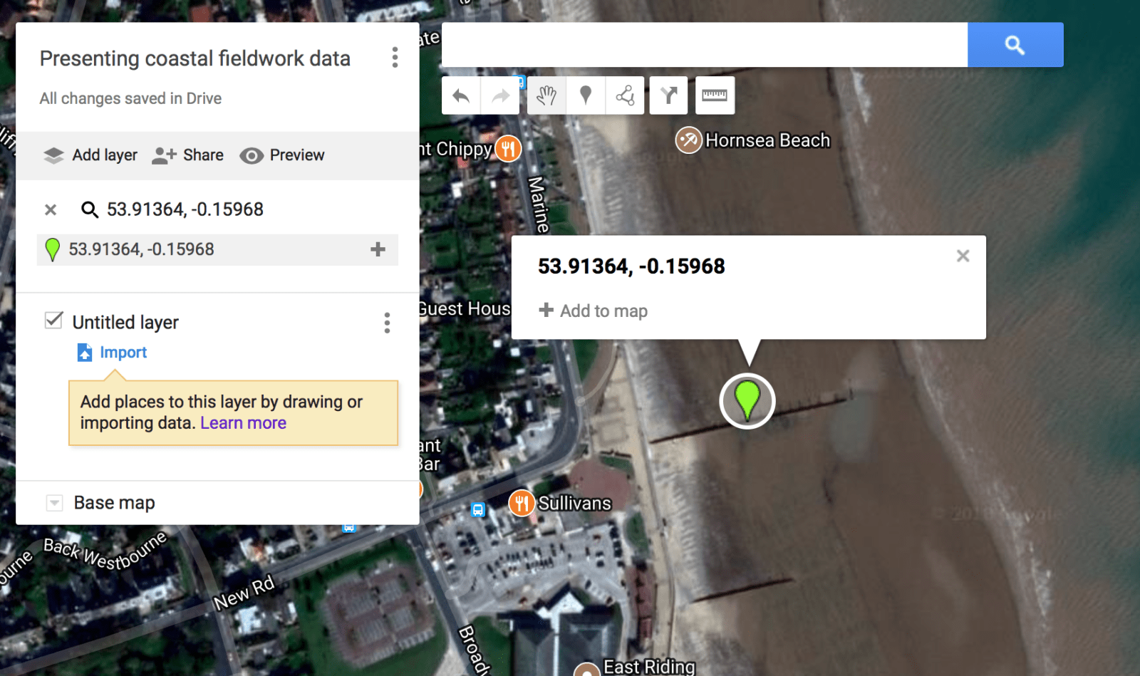
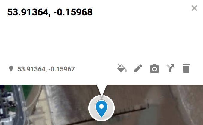
Then click the first location you collected data. Repeat this for each location. In order to accurately plot your sites on the map, it is a good idea to record the exact location using GPS. This can be done using an app on your phone or by using a GPS tracker. If you know the GPS locations type them into the search box as below.

Then press enter. A green pin will be added to the map. You then need to hover over the pin and click +Add to map.
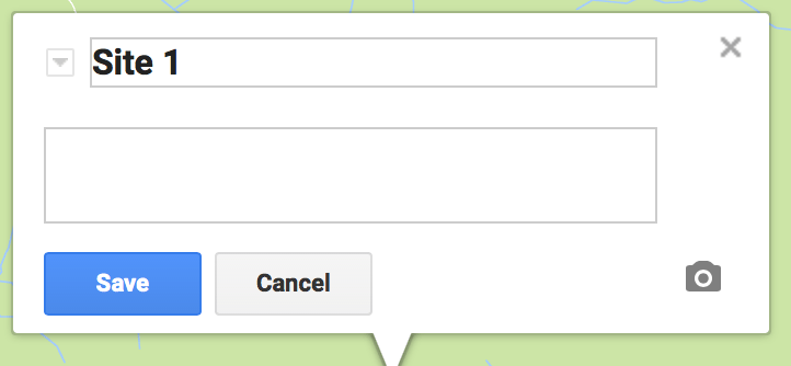
You now need to re-name the pin. To do this you should click the pin then click the pencil icon.
Next, identify the site number.
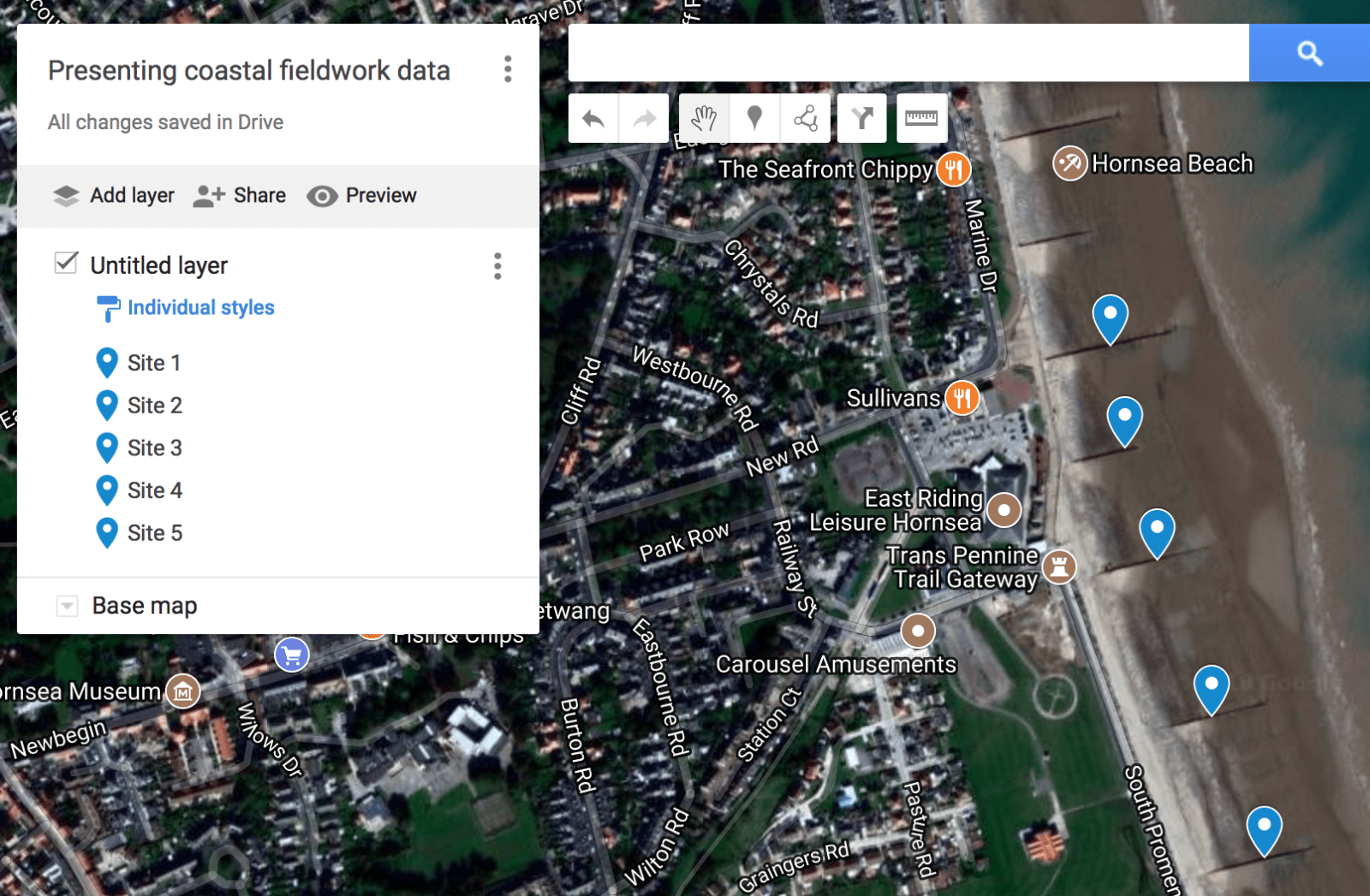
Repeat this for all your sites. The map now has 5 sites located.
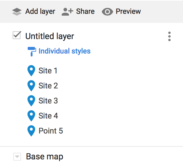
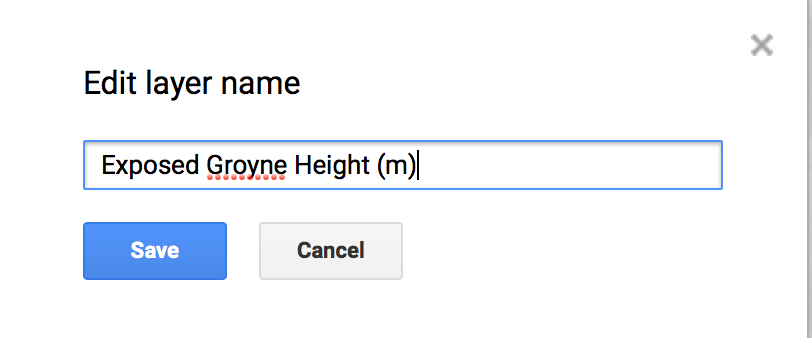
Next, we are going to name the layer. To do this click Untitled layer from the menu on the left. Then, rename the layer.
In this case, we will name the layer Exposed Groyne Height (m) as I am going to add the height of the exposed groyne (difference between the updrift and downdrift beach) at each location. Click Save when you’ve done it.
Next, click on the marker for Site 1. Then click the pencil icon. In the comment box type add the height of the exposed groyne at this site. Only type the raw number. In this case, the height is in cms.
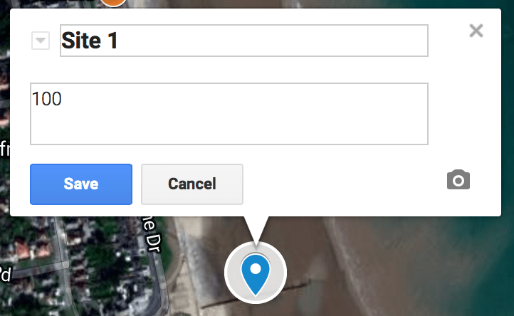
Repeat this for all your other sites.
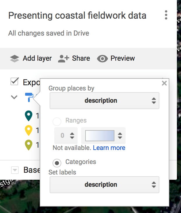
Next, we are going to colour code the markers to indicate changes in the height of exposed groynes. To do this click Individual systems from the left menu.
Then, select group places by the description and Set labels by description.
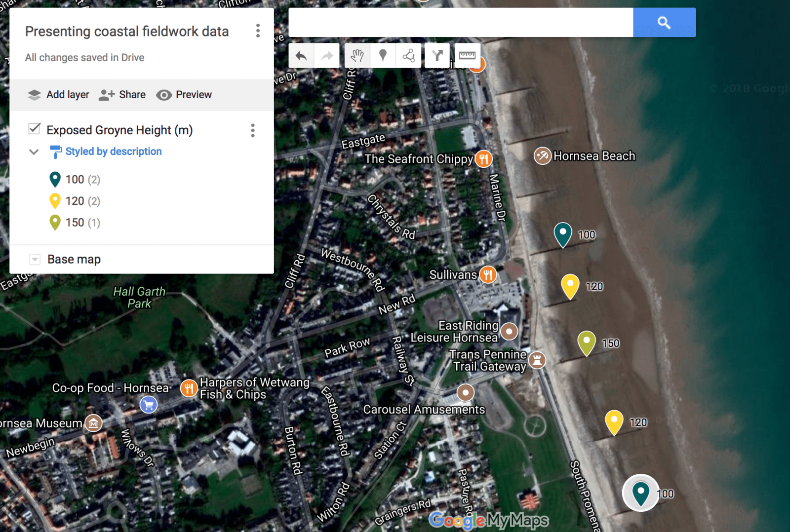
The map now looks like this:
You can view the example map here.
If you have further data to add you can create a new layer and add this. Or, you could duplicate the map and change the data for each location.
Need to share your map? Take a look at our guide here.
Take look at the other Google My Maps tutorials for more ideas on how you can use the app for presenting data.
If you are looking to further the develop the use of Google Apps in your classroom or school our friends over at Cre8tiveIt.solutions can provide support and training with the use of Google Suite, Google Drive, Google Edu and Google Classroom.
Anthony Bennett


Leave a Reply
Want to join the discussion?Feel free to contribute!