A technique for graph interpretation exam questions using TEA
Guest blogger Adam McAllister (@McAllister_Geog), geography teacher of two years, shares a strategy for interpreting graphs.
Despite my young years, it was clear that when working with data and graphs in lessons, children struggled with interpretation. Both children in key stage 3 and those studying GCSE struggled with graph interpretation. As a result, I started to use and embed TEA (trend, example, and anomaly). A simple but effective strategy. However, was it as simple as I first thought?
Well, the answer was perhaps not. Trying to embed new strategies with children can be rather challenging as I found out! It is all about routine, routine, routine. Children have to be trained to do the things that we expect. It is just like riding a bike. You have to learn/be taught first before removing the stabilisers – and much confidence!
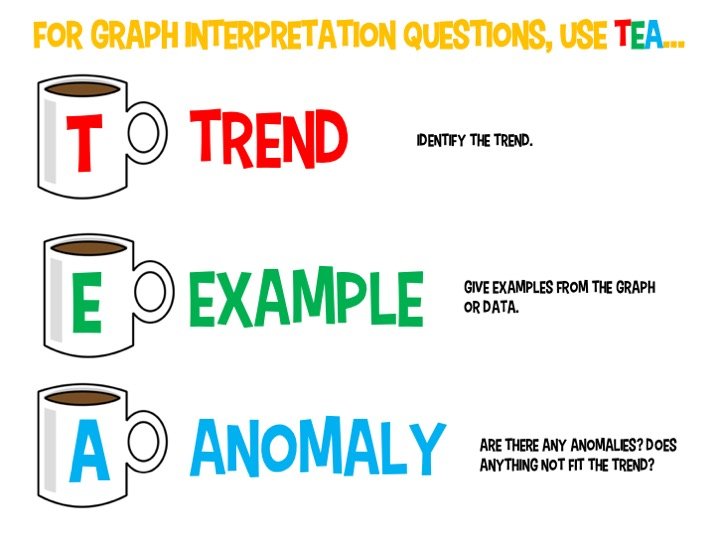
T stands for trend. Children need to look for a trend or pattern in a data set or graph. There must be a trend to identify, otherwise, the exam question would be rather pointless in my eyes. Trends that I would ask children to look for would be the basic increase/decrease for one, but whether the data/graph fluctuates. Other things that I would ‘train’ them to look for would be whether the rate of decrease and/or increase is rapid, slow, constant.
E stands for example. At this stage of TEA, I would ask children to look for an example or evidence that backs up the first initial point that have identified. Whether this is quoting the rate of increase, the years at which there is a decrease. It is also vitally important to embed that if a graph or data figure has a specific unit, this should also be quoted in any given answer.
A stands for anomaly. This one may be a little trickier. At times there may not be an anomaly. It is okay that we and the children we teach accept this. If an anomaly is identified, this needs to be placed into the answer. Examples would include a decrease/increase or significant change in the data or figure. An anomaly could be as simple as something that does not fit the trend you earlier identified! Again, this should be supported with an example or evidence.
TEA Graphs in Geography
Working on this strategy at my current school has seen improvement of answers given, in relation to data and graph interpretation questions. It is still a work in progress currently, but I am delighted with the strides taken forward!
Adam McAllister
August 2019

Internet Geography is offering a platform for guest bloggers for this academic year. Got a teaching strategy, interest or anything geographical you’d like to share? Please contact us. We’re unable to offer a financial award but we’ll send you a little treat in the post.


Leave a Reply
Want to join the discussion?Feel free to contribute!